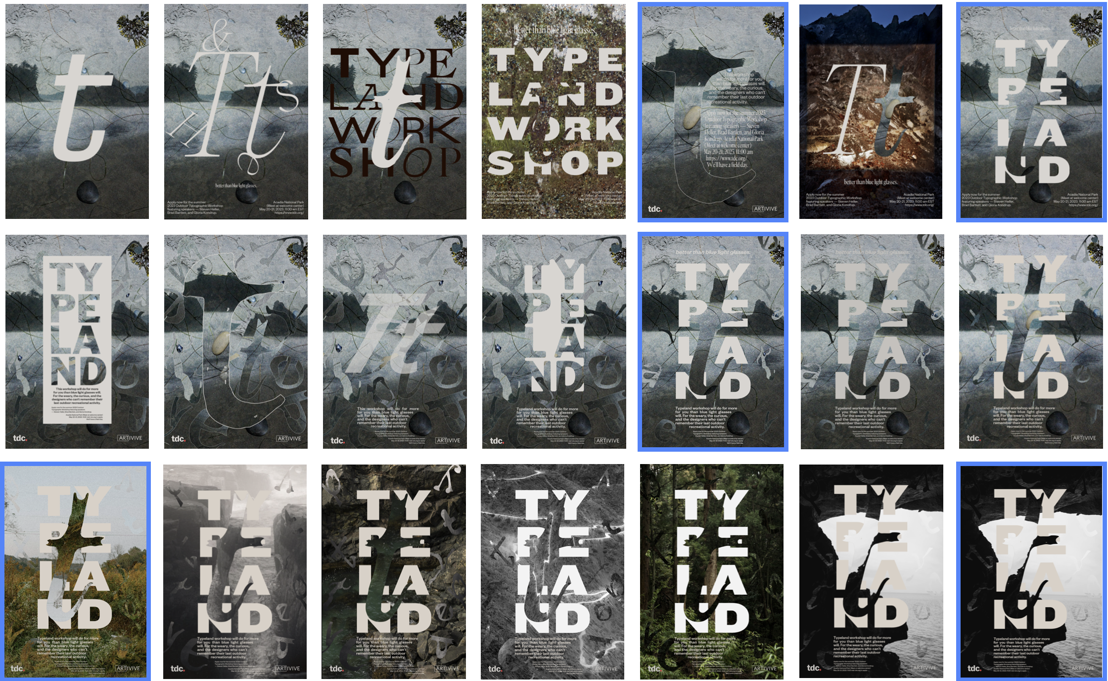
The charge of this project is to design a poster with a motion element that will appeal to new and seasoned type lovers alike and encourage viewers to apply to the program. The client needs a poster that will reflect the unique nature of this event. This is not another exhausting and verbose seminar about type (though that can be fun too). This is a design focused getaway about reconnecting with nature and design simultaneously. This is about re-sparking that child-like wonder towards design. This is about discovery.
I believe that this solution addresses the main pain points design workshops and events. It conveys a peaceful and slow tone while feeling inventive and curious. It is approachable, but adult, and encourages type lovers to apply for this program. I think it walks the line between work and rest, which at the end of the day is what most burnt out designers lack.
I was worried about pushing the envelope too far in the hand done type. It’s necessary to appeal to type designers and type enthusiasts of all kinds, so finding a balance between elegant/ beautiful type and inventive/ creative type was harder than I thought it would be. I was surprised at how important photography was going to be. It took a while to find the right image, and I could have sworn the image I first started with was the solution image. I was wrong. I learned a ton about drawing type and making considerate type in the project. I learned about quiet and loud tweaks in typography.
*Key steps in the process
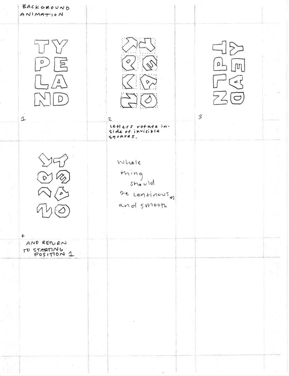
*Key Frame Sketches


